Print Studio: App redesign
Goal
Update Print Studio’s app to make it faster, easier, and clearer to use.
Objective
My key objective was to modernize the app and bring parity with the Social Print Studio website.
I could do this adding the ability to explore products, all products to the app, and additional payment options (like Stripe and gift cards). I also needed to perform a content audit to ensure all check-out flows were consistent.
A big app update was the perfect opportunity to clean up inconsistent web vs. app experience, refresh the brand, and convert more app users.
The ultimate goal was to find more users and increase conversions.
And this was the small team at Social Print Studio I collaborated with throughout the process:
🐴 Laurel- Product Designer
🐸 Animesh - Engineer
🐼 Cara- Marketing Lead
🐯 Jenny - Customer Service Lead
🐻 Tawny - CEO
OPPORTUNITIES
Increase success rate for first time purchasers
Implement intuitive architecture that could scale as SPS expands its catalog of products
Mature brand (visual, voice, and tone)
Add full catalog of products to mobile
Institute saving feature; add payment options
Design elements of discovery and inspiration
Add customer reviews and gift cards
Create consistency of ordering process across product category
TEAM
Core Team: Content Strategist, Front-end Engineer, Product Designer, Marketing Lead
Stakeholders: CEO, Customer Service Team
PROCESS
5 months (Sept. 2019–Jan. 2020)
10 directions to user test
1 to launch (Jan. 2020)
KEY RESULTS
Positive customer response
Downloads
Conversions
Process
1 — Questions & alignment 🤝
Get to know engineer better
Ask clarifying technical questions
Get on the same page as the product designer
Ask clarifying questions around business goals
2 — Audit ✅
Perform content audit of website and app
Discover only 60% of our products are even on our app
3 — Strategize🤔
Start writing
Perform competitive analysis
Estimate content load
Track Eng’s bandwidth vs. my growing content wishlist
4 — Develop Content and User Experience ✍
Write all strings, helper text, product copy, and CTAs
Provide content and flow feedback for product designer
Seek feedback from marketing lead and customer service lead who have lots of legacy knowledge
Initiate lightweight user testing with nice friends and family
Simultaneously plan marketing launch for app drop
5 — Localize, Launch, and Test 🚀
Work 1:1 with engineer to finalize content
Test CTAs with dynamic links in Branch
Deal with any last minute surprises
Debugging parties
Launch in the App Store!
Project pillars
1
Redefine architecture
2
Clarify core user flows
3
update & unify voice & tone
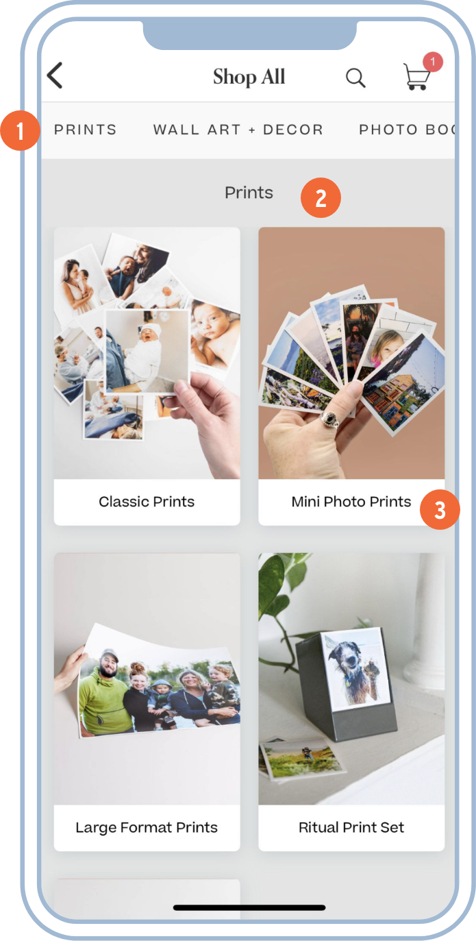
Redefine architecture
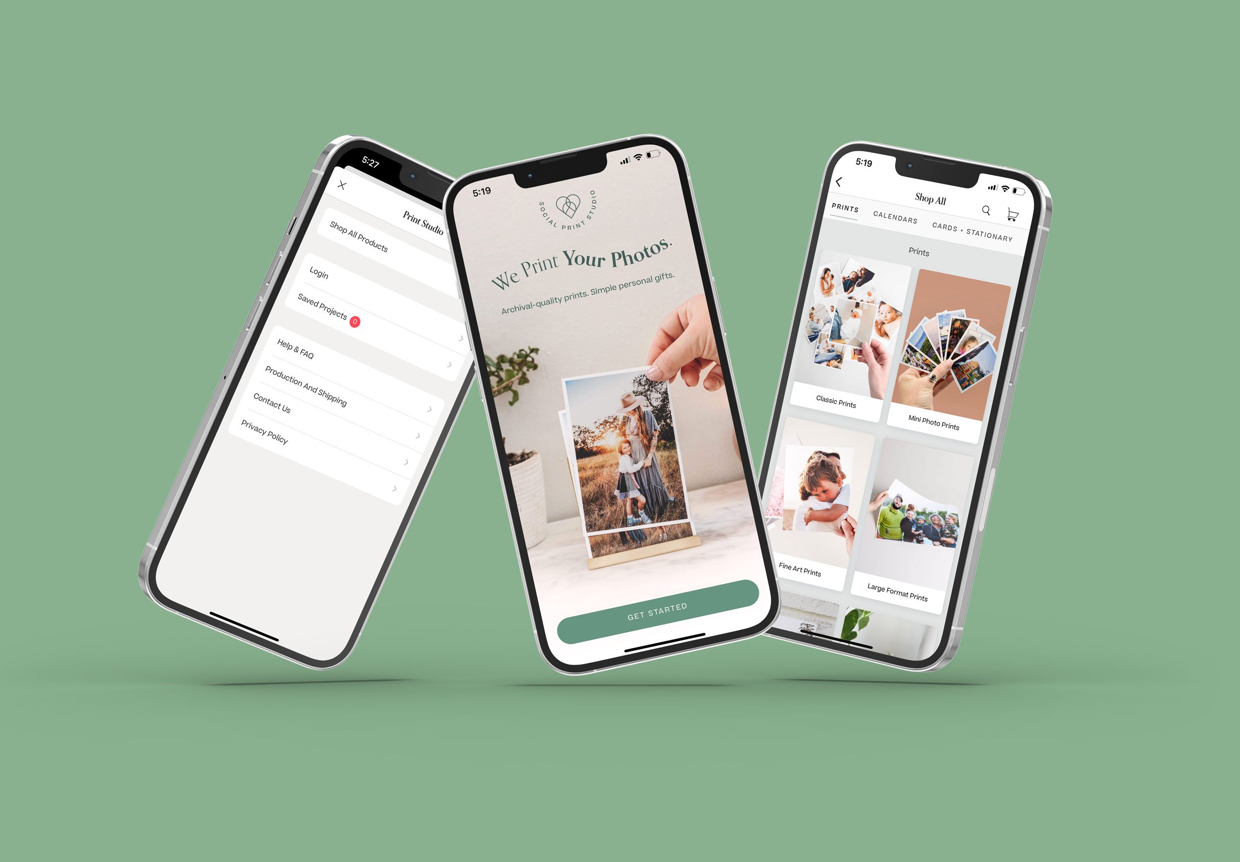
1 — Category Carousel
I created a simple naming system for our top-level categories and added them in as tabs within the “shop all” page.
2 — Category Overview Page
Our product catalog is massive with many different formats and sizes for each product type. We needed to help customers narrow down before seeing the entire product catalog.
3 — Sub-Categories
I then created naming conventions for our mid-level categories to help customers find the type of product they want before being shown the many options available within those sub-categories.
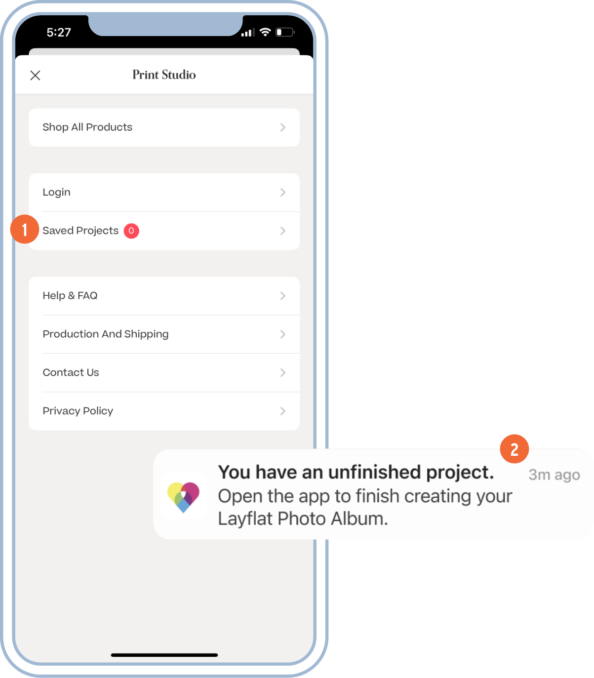
Clarify core user flows
1 — In-App Reminders
We added in-app reminders to help users complete their unfinished photo projects.
2 — Push Notifications
We also sent a push notification two hours after a project was saved and the app closed to remind users to complete unfinished projects.
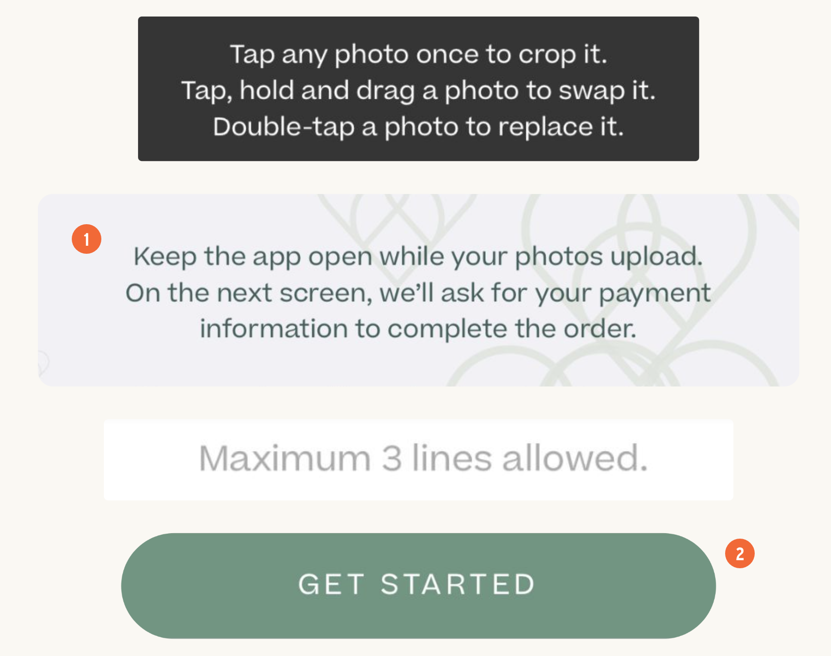
1 — Helper Text
At crucial moments in the user journey, microcopy communicates to the user helpful information: instructions on how to use layout tools, messaging to set expectations while photos upload, or information on character limit when creating a personalized book title.
2 — Button Text
Clearly state the user’s next step. In this case, they’re about to begin their project. ‘Get Started’ insinuates there are multiple steps—just what we want the user to understand.
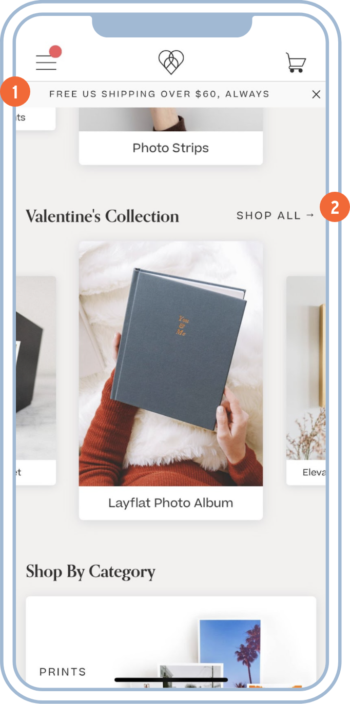
Update and unify voice & tone
1 — Persistent Shipping Promotion
Rather than being pushy with aggressive promotions, we wanted to build trust by letting our customers know we would always offer a benefit to customers willing to try our service. This copy reflects that commitment.
2 — Relevant Collections
By presenting these seasonal recommendations (e.g. Mother’s Day, Graduation, Valentine’s Day, etc.) as “collections” they feel like curated guides for users who are not sure what they are looking for.
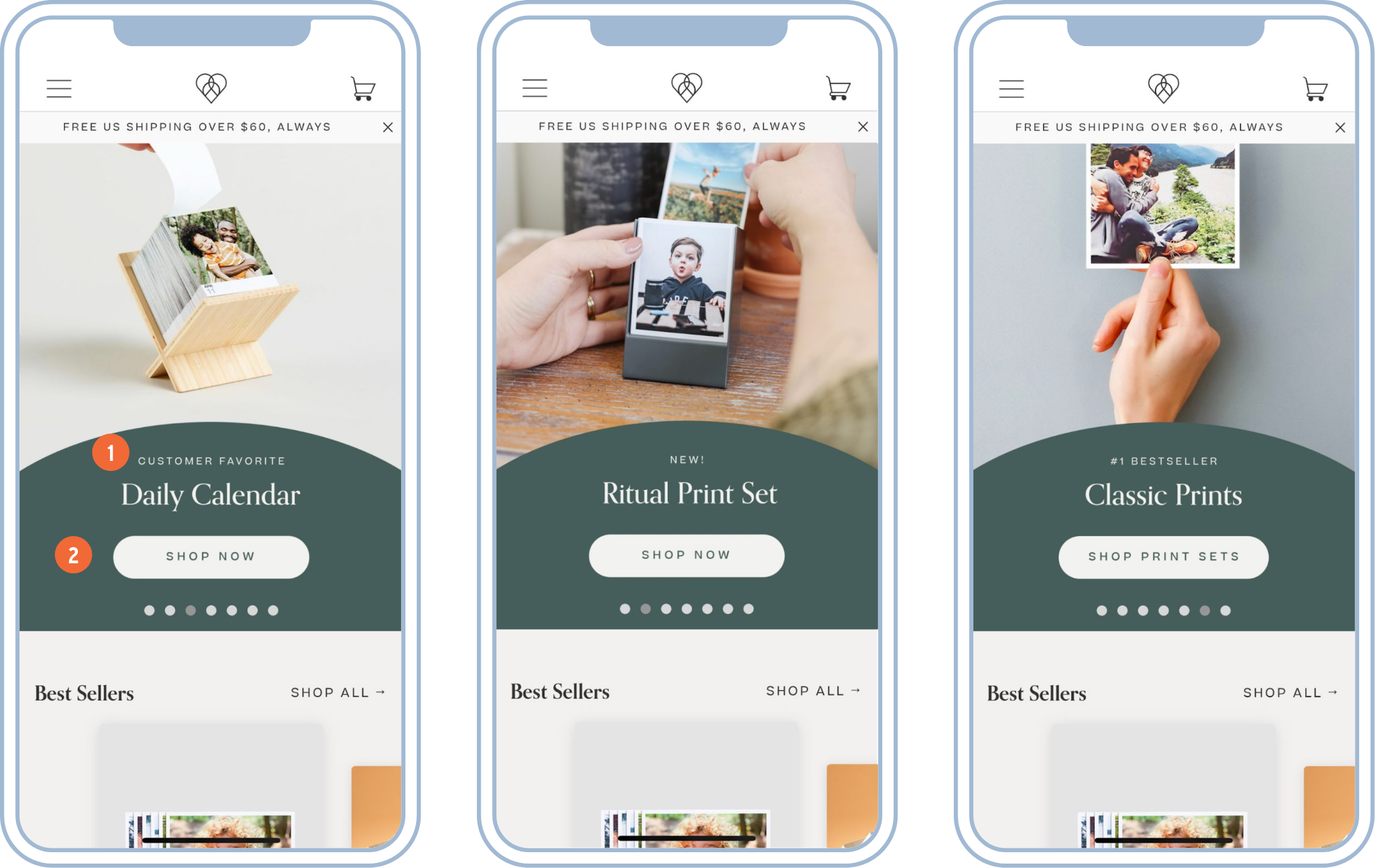
1 — Marketing Microcopy
I created a system for adding simple and clear context to our promoted products like “new!”, “customer favorite”, and “#1 bestseller”.
2 — Button Microcopy
We also tested different entry points, some leading to specific product pages (e.g. Daily Calendar and Ritual Print Set) and some leading to sub-categories (e.g. Classic Prints).
Key results
After the latest version dropped in the App Store, I tracked content design results in a few ways.
And just like my projects at Meta, I defined “better results” in a lot of ways. Here are a few results that made my content strategist heart happy:
⬆ click thru rate
⬆ happy customer emails
⬇ Loading times
= positive App Store reviews (avg. 4.8 rating)
= Nothing breaking (at least, not for long lol)
Happy team
Checking the redesign off our marketing goals
Pleased Executive Board
Aesthetically-pleasing, easy to use app
Website and App brand consistency

