Blue Shield of California: Making claims make (more) sense
The Goal
To improve the claims flow, decrease member confusion, and update to our new design system.
Objective
My key objective was to improve the claims cards on Blue Shield of California’s website and mobile app.
My first step was to dog food the “claims experience” and get a sense of what was happening before, after, and while members were checking out their claims.
What I uncovered was sticky and got all over 7 other projects I was working on. But, digging deeper was for the best. (Though it was hard to see that at first. Ugh.)
PROCESS
2 months (Jan. 2024–Feb 2024)
6 rounds of Userzoom testing
Design team collaboration in Figma and content docs
Legal and Privacy reviews
Multiple content quality reviews with feedback
OPPORTUNITIES
A/B test clearer, simpler content
Explore filtering and establish precedent in design system
Create consistency across the Pharmacy experience
Document content design process; document guidelines as I worked
TEAM
Core Team: Content Designer, UX Designer, UI Designer, Product Manager, UX Design Lead
Stakeholders: PM Lead, UX team lead
KEY RESULTS
Positive stakeholder reaction (excitement!)
BSCA member reaction (<Help tickets, +UXR)
Updated to Cerulean design system (consistency across the Pharmacy experience)
Create consistency across the Pharmacy experience
UX team process retro and project checklist for future projects
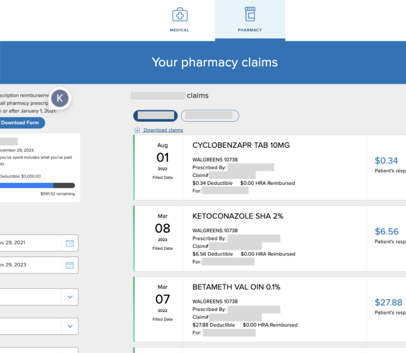
Claims: before

Weak and Confusing H1’s: “Pharmacy” tested poorly. People were confused if it meant picking up prescription drugs, or prescription drugs.
Content Hierarchy Missing: With no clear content hierarchy, we saw a lot of user confusion.
Mr. Robot: Adding in words like your and replacing “patient’s responsibility” with something like “your cost” was a quick and easy win.
Expanded/Collapsed States: What do you show on a collapsed claims card? Should the first card always be expanded? How large can they be at various breakpoints? These were all questions to work through.
Poor Readability: Stakeholders clarified the most important information in the cards—and I got rid of the rest.
A/B testing on UserZoom
🧪I supported our UX researcher in asking the right questions about information hierarchy and clarity.
We knew that any design improvement would help. The BSCA UX team follows the 70/30 rule: 70% better is still so much better for the majority of users. It’s better to be agile and iterate then spin.
arrow_upward
User Understanding
Confusion
arrow_downward
How can we create clear information hierarchy so users know where to look?
How can we untangle these confusing health care terms?
How can we take what we’re doing here, and apply it across our 8 pharmacy-related projects?
And here were some of the key results. It was obvious right away that a clear content hierarchy was missing.

Need to figure out which information needs to be shown and which to delete
Need clearer UI
Need better readability (6th grade)
Users spent the most time on the price
Some of the buttons performed better as icons with a link
sentiment_dissatisfied
Claims before
rocket_launch
Claims after

A little more…
From November 2023 to present, I’ve worked at Blue Shield of California. Did you know that it’s a B corp with a CEO headstrong on blowing up the prescription drug industry? Yeah, me neither.
It’s been fun.
Can I show you a few before and afters*? It’ll give you a taste of the lightspeed I’ve been working at in the last few months:
sentiment_dissatisfied
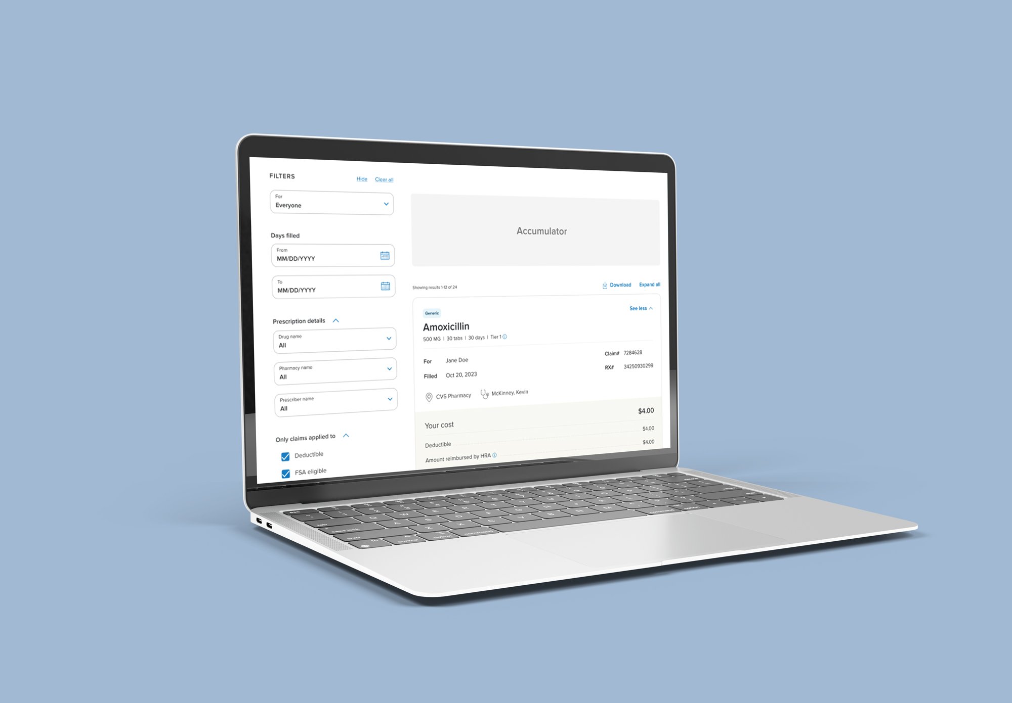
Accumulator before

rocket_launch
Accumulator after

The“accumulator” shows members how much they’re spending.
Biggest win: Persuading stakeholders to replace “preferred/non-preferred” with “in-network/out-of-network”— supported by UX research, competitive analysis, and gut instinct.
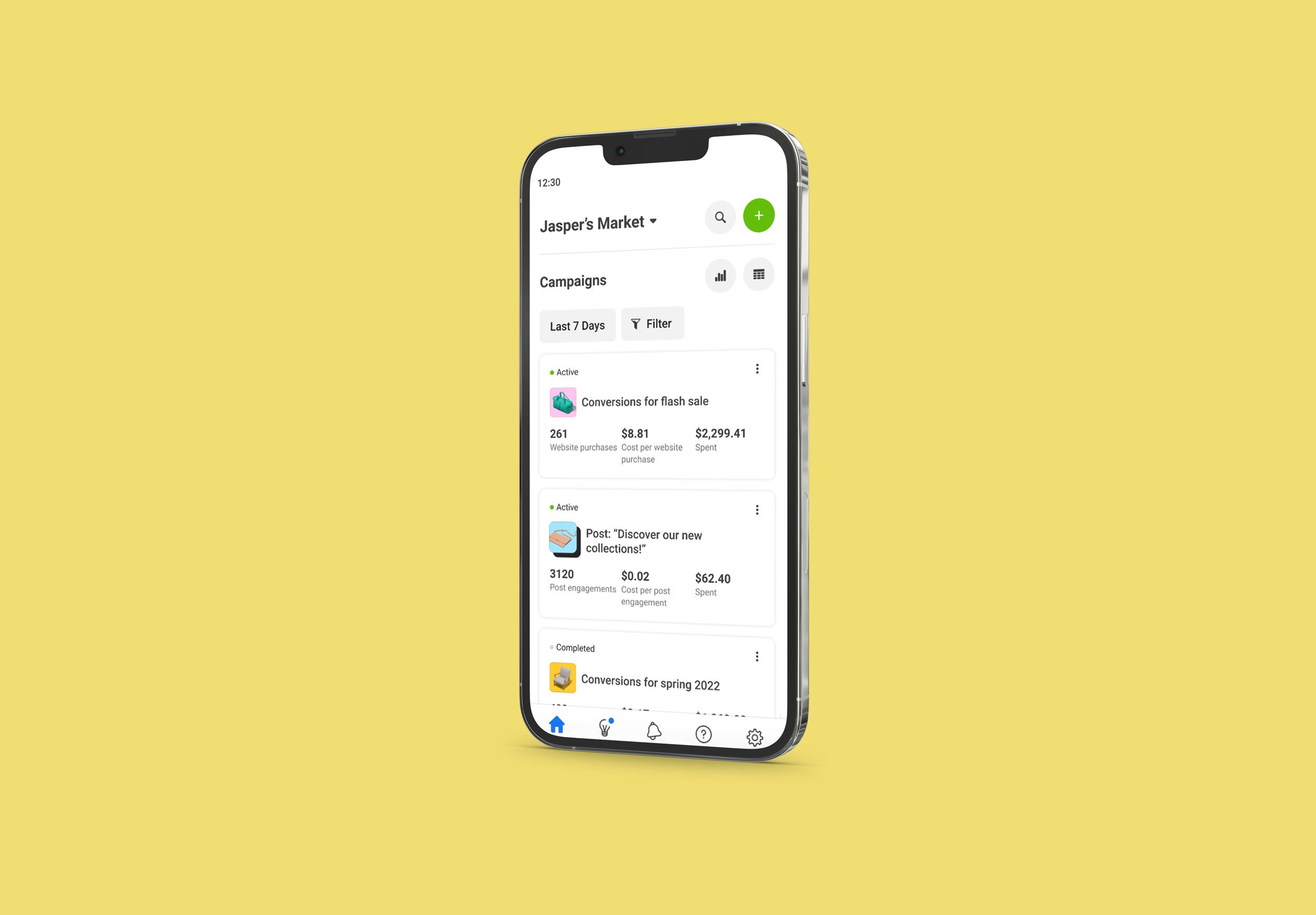
sentiment_dissatisfied
Prior authorization before

rocket_launch
Prior authorization after

Biggest wins: Removing the customer service phone number, adding a form link, and adding helpful FAQs in an accordion within the page.
sentiment_dissatisfied
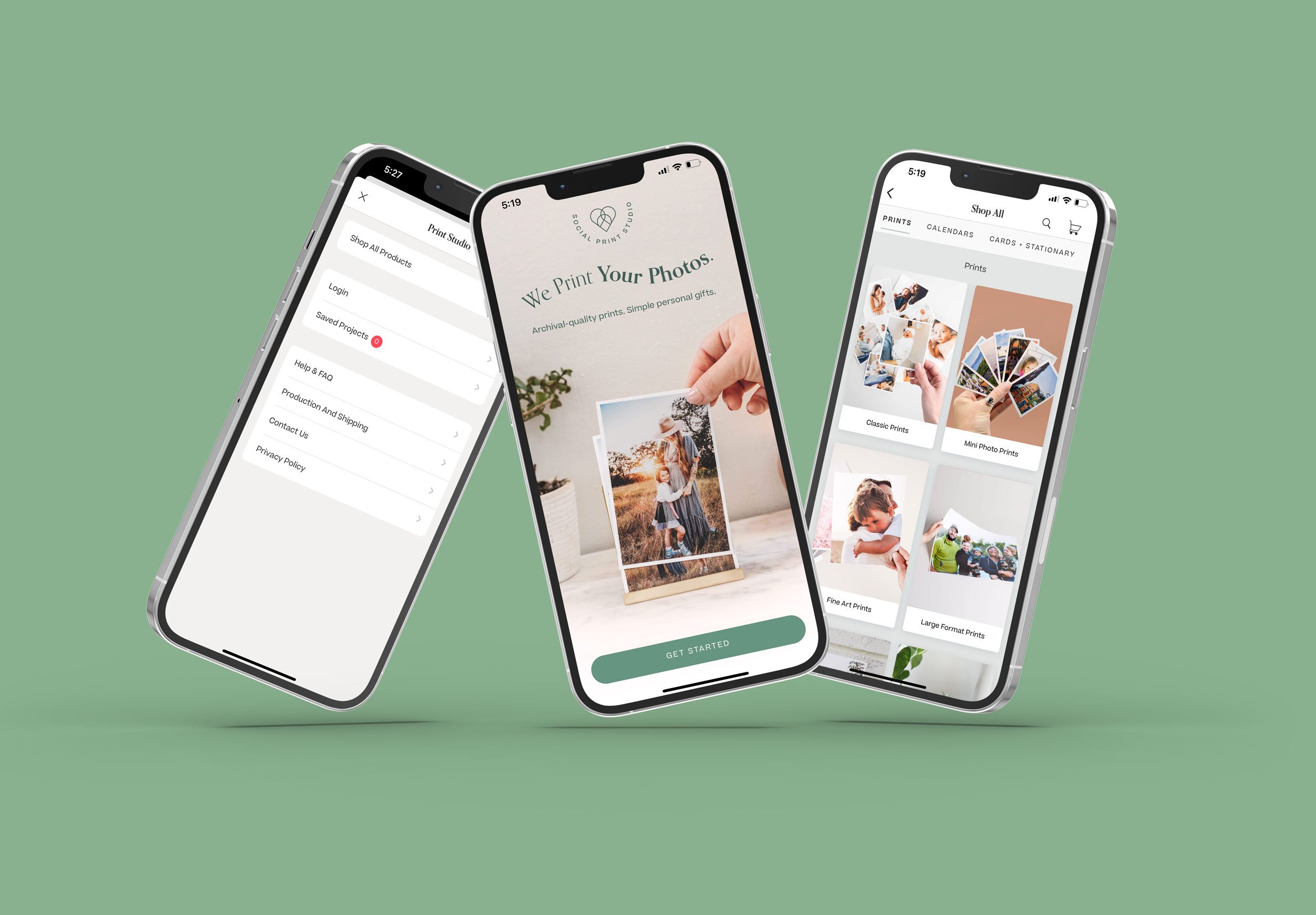
Amazon pharmacy before
rocket_launch
Amazon pharmacy after

Our new prescription home delivery partner.
Biggest win: Working with the Amazon UX team, created 2 separate cards that link to the co-branded Amazon/BSCA page.
*Each of these are full flows but I’m only highlighting a small portion.